This tutorial gives an overview of the usage of important Flutter widgets.
1. About this guide
This tutorial gives an overview of important widgets and example usage. Other guides in this Flutter series explain the development with Flutter:
2. Using standard Flutter widgets
This section provides an overview of the usage of important standard Flutter widgets.
It serves as a reference for utilizing widgets in your Flutter applications. Each section includes one or more examples that you can easily copy and paste in your codebase.
Examples may consist of a complete app listing if applicable, or it could be the definition of the widget alone. In the latter case, you can insert it into the following code template by replacing the comment with the actual widget code.
import 'package:flutter/material.dart';

void main() {
  runApp(const MainApp());
}

class MainApp extends StatelessWidget {
  const MainApp({super.key});

  @override
  Widget build(BuildContext context) {
    return MaterialApp(
      debugShowCheckedModeBanner: false,
      home: Scaffold(
        body: Center(
          child: buildWidget(),
        ),
      ),
    );
  }

    Widget buildWidget() {
    return
    // WIDGETCODE (1)
  }
}| 1 | Remove the comment in the above line and replace the WIDGETCODE placeholder with the actual widget code. Depending on the widget you may have to add const to avoid a warning. For example, Text('Hello World!'); |
For example, the following could be pasted onto the line that contains WIDGETCODE.
Text('Hello World!');2.1. Scaffold
The Scaffold widget offers convenient APIs for displaying common user interface elements, including drawers, snack bars, bottom sheets, and floating action buttons.
It sets various defaults, such as theming, and provides direct properties for various child widgets.
A complete example of the usage of the Scaffold widget could resemble the following:
import 'package:flutter/material.dart';

void main() {
  runApp(const MainApp());
}

class MainApp extends StatefulWidget {
  const MainApp({Key? key}) : super(key: key);

  @override
  State<MainApp> createState() => _MainAppState();
}

class _MainAppState extends State<MainApp> {
  int buttonClicks = 0;
  int currentIndex = 0;

  void onButtonPressed() {
    setState(() {
      buttonClicks++;
    });
  }

  void onItemTapped(int index) {
    setState(() {
      currentIndex = index;
    });
  }

  @override
  Widget build(BuildContext context) {
    currentIndex;
    return MaterialApp(
      debugShowCheckedModeBanner: false,
      home: Scaffold(
        appBar: AppBar(
          backgroundColor: Colors.grey, // Set your desired background color
          leading: IconButton(
            icon: const Icon(
              Icons.menu,
            ),
            onPressed: () {
              print('Home pressed');
            },
          ),
          title: const Text("Hello"),
          actions: [
            IconButton(
              icon: const Icon(
                Icons.search,
                semanticLabel: 'search',
              ),
              onPressed: () {
                print('Search button');
              },
            ),
            IconButton(
              icon: const Icon(
                Icons.filter_list,
                semanticLabel: 'filter',
              ),
              onPressed: () {
                print('Filter button');
              },
            ),
          ],
        ),
        body: Center(
          child: Text(
            "Selected tab index: $currentIndex, Button pressed: $buttonClicks",
            style: const TextStyle(
              fontSize: 20, // Adjust the font size as needed
              fontWeight: FontWeight.bold,
            ),
          ),
        ),
        floatingActionButton: FloatingActionButton(
          onPressed: () {
            onButtonPressed();
          },
          child: const Icon(Icons.add),
        ),
        bottomNavigationBar: BottomNavigationBar(
          currentIndex: currentIndex,
          onTap: onItemTapped,
          items: const [
            BottomNavigationBarItem(
              icon: Icon(Icons.home),
              label: 'Home',
            ),
            BottomNavigationBarItem(
              icon: Icon(Icons.business),
              label: 'Business',
            ),
          ],
        ),
      ),
    );
  }
}
The app looks similar to the following screenshot.
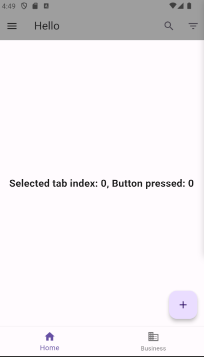
The following table lists and explains important properties of the Scaffold widget.
| Property | Type | Description |
|---|---|---|
|
|
An |
|
|
The content of your page. |
|
|
A round button, commonly located near the bottom right of the screen. Typically used as a contextual action button for frequently performed actions. It is often referred to as a FAB. |
|
|
A bar of actions at the bottom of the screen. Typically, this is an omnipresent navigation bar that provides access to other pages of the app. |
Additional settings related to positioning, theming, and other behaviors are available for customization.
2.2. Container
The Container widget is designed to hold a single child.
When used without children, a Container attempts to occupy as much space as possible.
The Container widget can be styled with features such as a background color through its color property and more intricate styling using the decoration property.
Explicit height and width can also be set, providing control over the element’s constraints.
Container(
  margin: EdgeInsets.all(10.0),
  child: Text('Text'),
  width: 150.0,
  height: 150.0,
  color: Colors.green,
  decoration: BoxDecoration(
    border: Border.all(color: Colors.grey),
    borderRadius: BorderRadius.circular(5.0),
  ),
)
This example would render a 150 by 150-pixel green box with the text "Text" displayed within it.
|
When a |
2.3. Text and TextFields
-
Text: Represents a label for displaying static text.
Text(
  'Hello, Flutter!',
  style: TextStyle(fontSize: 18, fontWeight: FontWeight.bold),
)-
TextField: Enables users to input and edit text interactively.
String enteredText = ''; // Define a variable to store the entered text
TextEditingController textController = TextEditingController();
TextField(
controller: textController, // Use a text controller to access the text property
decoration: InputDecoration(
labelText: 'Enter your name',
),
onChanged: (text) {
enteredText = text; // Update the entered text when it changes
print('Entered text: $enteredText');
},
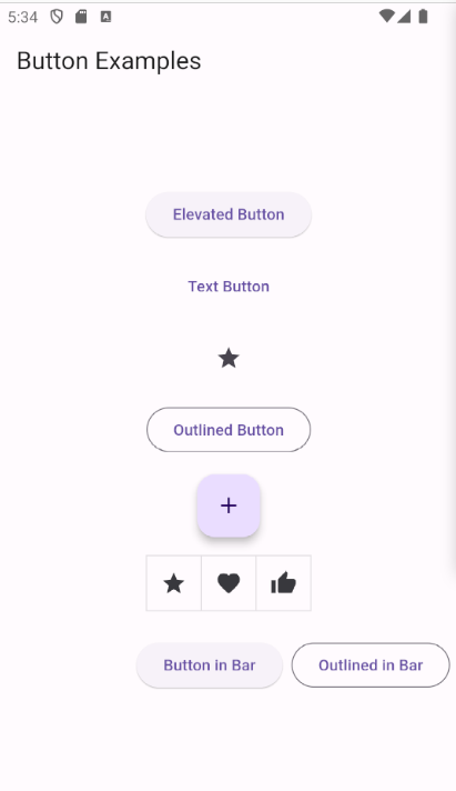
)2.4. Buttons
Flutter provides multiple default button implementations:
-
ElevatedButton: A button with a background color, used to represent the prominent button. -
TextButton: A text button. -
IconButton: A button with an icon, typically used in an application bar, has no child property but an icon property. -
OutlinedButton -
FloatingActionButton -
ToggleButtons
A layout should contain a single prominent button, making it clear that other buttons have less importance. This prominent button represents the action we most want our users to take to advance through our app.
These button widgets typically have the following properties:
* child: Contains the widget shown for this button, frequently a Text widget.
* onPressed: Takes a method reference that is executed when the button is pressed.
To group buttons, you can use ButtonBar, which is similar to a Row but automatically wraps its children if there is not sufficient space.
Buttons with no onPressed property set or only null assigned are disabled by the Flutter framework.
The following code shows the usage of the various button types.
import 'package:flutter/material.dart';

void main() {
  runApp(const MyApp());
}

class MyApp extends StatelessWidget {
  const MyApp({Key? key}) : super(key: key);

  @override
  Widget build(BuildContext context) {
    return MaterialApp(
      debugShowCheckedModeBanner: false,
      home: Scaffold(
        appBar: AppBar(
          title: const Text('Button Examples'),
        ),
        body: Center(
          child: Column(
            mainAxisAlignment: MainAxisAlignment.center,
            children: [
              ElevatedButton(
                onPressed: () {
                  // Handle ElevatedButton press
                  print('ElevatedButton pressed');
                },
                child: const Text('Elevated Button'),
              ),
              const SizedBox(height: 16),
              TextButton(
                onPressed: () {
                  // Handle TextButton press
                  print('TextButton pressed');
                },
                child: const Text('Text Button'),
              ),
              const SizedBox(height: 16),
              IconButton(
                onPressed: () {
                  // Handle IconButton press
                  print('IconButton pressed');
                },
                icon: const Icon(Icons.star),
              ),
              const SizedBox(height: 16),
              OutlinedButton(
                onPressed: () {
                  // Handle OutlinedButton press
                  print('OutlinedButton pressed');
                },
                child: const Text('Outlined Button'),
              ),
              const SizedBox(height: 16),
              FloatingActionButton(
                onPressed: () {
                  // Handle FloatingActionButton press
                  print('FloatingActionButton pressed');
                },
                child: const Icon(Icons.add),
              ),
              const SizedBox(height: 16),
              ToggleButtons(
                onPressed: (int index) {
                  // Handle ToggleButtons press
                  print('ToggleButtons pressed: $index');
                },
                isSelected: List<bool>.filled(3, false),
                children: const [
                  Icon(Icons.star),
                  Icon(Icons.favorite),
                  Icon(Icons.thumb_up),
                ],
              ),
              const SizedBox(height: 16),
              ButtonBar(
                children: [
                  ElevatedButton(
                    onPressed: () {
                      // Handle ElevatedButton in ButtonBar press
                      print('ElevatedButton in ButtonBar pressed');
                    },
                    child: const Text('Button in Bar'),
                  ),
                  OutlinedButton(
                    onPressed: () {
                      // Handle OutlinedButton in ButtonBar press
                      print('OutlinedButton in ButtonBar pressed');
                    },
                    child: const Text('Outlined in Bar'),
                  ),
                ],
              ),
            ],
          ),
        ),
      ),
    );
  }
}
2.5. Images
The Image widget provides helper methods to create images from various sources.
-
Image.asset -
Image.network
For instance, Image.network("https://picsum.photos/id/10/200/200"); creates an image from the given URL.
By default, Image does not provide caching or a placeholder image until it is loaded.
To address this, use the cached_network_image package.
This requires adding a dependency to this library in your pubspec.yaml.
CachedNetworkImage(
  placeholder: (context, url) => CircularProgressIndicator(),
  imageUrl: 'https://picsum.photos/id/10/200/200',
);
Certain widgets use an ImageProvider, such as NetworkImage.
To convert an Image to an ImageProvider, you can use the Image.image constructor.
For example:
ImageProvider myImageProvider = Image.image(myImage.image);To modify the color of an image, utilize the ColorFiltered widget.
For example, the following code grays out an image.
ColorFiltered(
  colorFilter: const ColorFilter.mode(
    Colors.grey,
    BlendMode.saturation,
  ),
  child: Image.network(
    'https://www.vogella.com/img/people/jennifernerlich.jpg',
    // ... other image-related properties
  ),
);
2.6. GestureDetector for defining a click-listener
Using a GestureDetector, you can register a click listener for any widget.
GestureDetector(
  onTap: () {
    print("onTap called.");
  },
  child: Text("foo"),
)
2.7. Flexible, Column, Row
The widgets in the Flex family facilitate arranging multiple widgets next to each other along the same axis.
The Column and Row widgets are specialized versions of the Flex widget, with their direction attribute set to Axis.vertical and Axis.horizontal, respectively.
If the layout direction is known, it is advisable to use Column or Row directly.
These widgets take a […] (list of Widget) as a constructor parameter, where you add the widgets that should be displayed.
2.7.1. Column
A Column widget arranges its children vertically:
Column(
  children: [
    Text('I will be above'),
    Text('I will be below'),
  ],
)
2.7.2. Row
A Row widget arranges its children horizontally:
Row(
  children: [
    Text('I will be left'),
    Text('I will be right'),
  ],
)
2.7.3. Flexible and Expanded
The Flexible widget (or its specialized version Expanded) enables the distribution of available space based on the weight defined by the flex attribute, with the default being 1.
Column(
  children: [
    Flexible(
      child: Container(color: Colors.black, child: Text("Hello")),
      flex: 2,
    ),
    Flexible(
      child: Container(color: Colors.red, child: Text("Testing")),
      flex: 1,
    ),
  ],
)
The actual direction of the list can be controlled by setting the mainAxisAlignment property.
|
2.8. Layout-Related Widgets
2.8.1. Wrap
In scenarios where there is not enough space to display all children, Flutter may show an error.

To address this, the Wrap widget comes into play.
It wraps its children if there is not sufficient space.

2.8.2. SizedBox, FittedBox, and Spacer
SizedBox is useful for constraining a widget to a specific size or adding fixed-sized space between widgets.
SizedBox(
  width: 100.0,
  height: 50.0,
  child: Text('Constrained Box'),
)
Spacer is employed to allocate empty space, allowing flexible layouts.
Row(
  children: [
    Text('Left'),
    Spacer(), // Allocates empty space
    Text('Right'),
  ],
)
FittedBox can resize a SizedBox based on constraints from its container.
Container(
  width: 200.0,
  height: 100.0,
  child: FittedBox(
    fit: BoxFit.cover,
    child: SizedBox(
      width: 100.0,
      height: 50.0,
      child: Text('Resizable Box'),
    ),
  ),
)
2.9. ListView, GridView, and ListTile
The ListView and GridView widgets allow displaying multiple widgets in a list or grid.
They enable scrolling automatically if their child widgets extend beyond the screen edge.
class TestWidget extends StatelessWidget {
  @override
  Widget build(BuildContext context) {
    return ListView(
      children: _createChildren(),
    );
  }

  List<Widget> _createChildren() {
    return [Text("Hello"), Text("Lars"), Text("Testing")];
  }
}
The ListView also provides a builder to create list items.
class TestWidget extends StatelessWidget {
  @override
  Widget build(BuildContext context) {
    return ListView.builder(
      itemBuilder: (_, index) => Text('Item $index'),
    );
  }
}
You can also use a separator.
class TestWidget extends StatelessWidget {
  @override
  Widget build(BuildContext context) {
    return ListView.separated(
      itemBuilder: (_, index) => Text('Item $index'),
      separatorBuilder: (_, index) => Divider(),
      itemCount: 100,
    );
  }
}
For reorderable lists, use the ReorderableListView widget.
2.10. PageView
The PageView widget allows swiping between different screens, with the ability to define a controller to set the initial page.

import 'package:flutter/material.dart';
import 'listview.dart';
import 'listviewbuilder.dart';

class MyPager extends StatelessWidget {
  final PageController controller = PageController(
    initialPage: 1,
  );

  @override
  Widget build(BuildContext context) {
    return Container(
      child: PageView(
        children: <Widget>[
          MyListView(), // a custom widget
          ListViewBuilder(), // another custom widget
        ],
      ),
    );
  }
}
2.11. Loading assets
Assets must be declared in the pubspec.yaml.
flutter:

  # The following line ensures that the Material Icons font is
  # included with your application, so that you can use the icons in
  # the material Icons class.
  uses-material-design: true

  assets:
    - assets/events.json
    - images/mypicture.jpeg
Afterwards, you can load them, for example, to load a text file:
DefaultAssetBundle.of(context).loadString("assets/events.json");2.12. Flavor-specific widgets
Most components are available in both Cupertino (iOS) and Material (Android) styles. However, it is up to you which flavor you use, not dependent on the host OS. It’s important to note that Android users might expect Material-style apps, and iOS users might expect Cupertino styles.
Conditional styling is possible, but it increases complexity in the app and, depending on the app’s size, might make UI testing a lot harder.
You can access the currently running host OS using Platform.isIOS and Platform.isAndroid.
3. Links and literature
3.3. vogella Flutter and Dart example code
If you need more assistance we offer Online Training and Onsite training as well as consulting