This tutorials describes how to create custom and compound views with Android.
1. Custom Views
1.1. Default views
The Android framework provides several default views.
The base class a view is the View.
Views are responsible for measuring, layouting and drawing themselves and their child elements (in case of a ViewGroup).
Views are also responsible for saving their UI state and handling touch events.
Developers can also create custom views and use them in their application.
It is possible to create custom views by:
-
Compound views - combining views with a default wiring
-
Custom views - creating your own views
-
by extending an existing view, e.g.,
Button -
by extending the
Viewclass
-
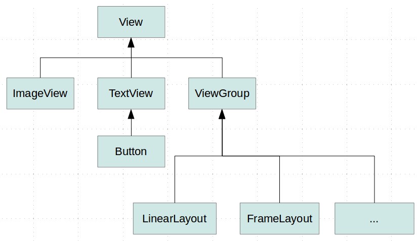
The following image shows the default view hierarchy of Android.
View are typically created to provide a user interface experience with is not possible with the default views. Using custom view allows the developer allow to do certain performance optimization, i.e., in case of a custom layout the development can optimize the layout manager for his use case.
1.2. How Android draws the view hierarchy
Once an activity receives the focus, it must provide the root node of its layout hierarchy to the Android system. Afterwards, the Android system starts the drawing procedure.
Drawing begins with the root node of the layout. The layout hierarchy is traversed in the order of declaration, i.e., parents are drawn before their children and children are drawn in the order of declaration.
Drawing the layout is a two pass process:
-
measuring pass - implemented in the`measure(int, int)` method. This happens as a top-down traversal of the view hierarchy. Every view stores its measurements.
-
layout pass - implemented in the
layout(int, int, int, int)method. This is also a top-down traversal of the view hierarchy. During this phase each layout manager is responsible for positioning all of its children. It uses the sizes computed in the measure pass.
| The measure and layout step always happen together. |
Layout managers can run the measure pass several times.
For example, LinearLayout supports the weight attribute which distributes the remaining empty space among views and RelativeLayout measures child views several times to solve constraints given in the
layout file.
A view or activity can trigger the measure and layout pass with a call to the requestLayout() method.
After the measure and layout calculation, the views draw themselves.
This operation can be triggered with the invalidate() method from the View class.
For a detailed introduction into the deeper layer of Android see https://source.android.com/devices/graphics/architecture.html.
1.3. Using new views in layout files
Custom and compound views can be used in layout files. For this you need to use the full qualified name in the layout file, e.g., using the package and class name.
<?xml version="1.0" encoding="utf-8"?>
<LinearLayout xmlns:android="http://schemas.android.com/apk/res/android"
    android:layout_width="match_parent"
    android:layout_height="match_parent"
    android:orientation="vertical" >

    <Button
        android:id="@+id/button1"
        android:layout_width="wrap_content"
        android:layout_height="wrap_content"
        android:text="Button" />

    <de.vogella.android.ownview.MyDrawView
        android:id="@+id/myDrawView1"
        android:layout_width="wrap_content"
        android:layout_height="wrap_content" />

</LinearLayout>|
Alternatively, you can also declare your name space in the layout file, similar to the Android name space. |
1.4. Create screenshots of views
Every View class support the creating of an image of its current display.
The following coding shows an example for that.
# Build the Drawing Cache
view.buildDrawingCache();

# Create Bitmap
Bitmap cache = view.getDrawingCache();

# Save Bitmap
saveBitmap(cache);
view.destroyDrawingCache();
2. Compound Views
Compound views (also known as Compound Components ) are pre-configured ViewGroups based on existing views with some predefined view interaction.
Compound views also allow you to add custom API to update and query the state of the combound view.
For such a control you define a layout file and assign it to your compound view.
In the implementation of your compound view you
predefine the
view
interaction.
You would define a layout file and extend
the corresponding
ViewGroup
class. In this class you inflate the layout file and implement the
View
connection logic
|
For performance reasons you may want to rewrite your compound
view to
a custom view which extends
|
3. Creating custom views
3.1. Creating custom views
By extending the View class or one of its subclasses you can create your custom view.
For drawing view use the
onDraw()
method. In this
method you receive a
Canvas
object that allows you to
perform drawing operations on it, e.g., draw
lines, circle, text or
bitmaps. If the view should be re-drawn you
call
the
invalidate()
method which triggers a call to the
onDraw()
method of this view.
|
If you define
own views, ensure you review the
|
To draw your
Views
you typically use the 2D Canvas API.
3.2. Measurement
The layout manager calls the
onMeasure()
method of the view. The view receives the layout parameter from the
layout manager. A layout manager is responsible to determine the size of all its
children.
The view must call the
setMeasuredDimenstion(int, int)
method with the result.
3.3. Defining custom layout managers
You can implement your
custom layout manager by extending the
ViewGroup
class. This allows you to implement more efficient layout managers or
to implement effects that are currently missing in the Android
platform.
A custom layout manager can override the
onMeasure()
and
onLayout()
method and specialize the calculation of its children. For example, it
can leave out the time consuming support of
layout_weight
of the
LinearLayout
class.
|
To calculate the size of the child you can use the
|
It
is a good practice to store any additional layout parameters
in an
inner
class of your
ViewGroup
implementation. For example, ViewGroup.LayoutParams ` implements command layout parameters, and
`LinearLayout.LayoutParams
implements additional parameters
specific to LinearLayout, as for
example the layout_weight
parameter.
4. Life cycle of a Andoid view
4.1. Life cycle events related to the window
A view is displayed if it is attached to a layout hierarchy which is attached to a window. A view has several lifecycle hooks.
The onAttachedToWindow() is called once the window is available.
The onDetachedFromWindow() is used when the view is removed from its parent (and if the parent is attached to a window).
This happens for example if the activity is recycled (e.g., via the finished() method call) or if the view is recycled.
The onDetachedFromWindow() method can be used to stop animations and to clean up resources used by the view.
4.2. Traversal lifecycle events
Traversals lifecycle events consists of Animate, Measure, Layout and Draw.
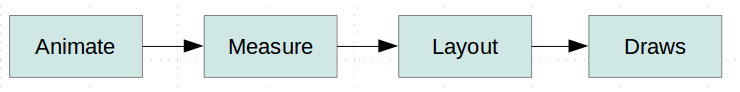
All views must know how to measure and layout themselves.
The requestLayout() method call tells the view to measure and layout itself.
As this operation may influence the layout of other views it calls also requestLayout() of its parent.
|
This recursive call is the reason why you should not nestle layout to deeply. The measure and layout operation might be expensive if a lot of hierarchies are re-calculated. |
The onMeasure() method determines the size for the view and its children.
It must set the dimension via the setMeasuredDimension() method in this method call before returning.
The onLayout() positions the views based on the result of the onMeasure() method call.
This call happens typically once, while onMeasure() can happen more than once.
4.3. Activity lifecycle
Views do not have access to the lifecycle events of the activities. If views want to get informed about these events, you should create an interface in the view which you call in the lifecycle methods of the activity.
5. Define additional attributes for your custom Views
You can define additional attributes for your compound or custom views.
To define additional attributes create an attrs.xml file in your res/values folder.
The following shows an example of attributes defined for a new view called ColorOptionsView.
<?xml version="1.0" encoding="utf-8"?>
<resources>
    <declare-styleable name="ColorOptionsView">
        <attr name="titleText" format="string" localization="suggested" />
        <attr name="valueColor" format="color" />
    </declare-styleable>

</resources>
To use these attributes in your layout file you have to declare them in the XML header.
In the following listing this is done via the xmlns:custom part of the code.
These attributes are also assigned to the view.
<LinearLayout xmlns:android="http://schemas.android.com/apk/res/android"
    xmlns:tools="http://schemas.android.com/tools"
<!-- define new name space for your attributes -->
    xmlns:custom="http://schemas.android.com/apk/res/com.vogella.android.view.compoundview"
    android:layout_width="match_parent"
    android:layout_height="match_parent"
    android:orientation="vertical"
>
<!-- Assume that this is your new component. It uses your new attributes -->
        <com.vogella.android.view.compoundview.ColorOptionsView
            android:layout_width="match_parent"
            android:layout_height="?android:attr/listPreferredItemHeight"
            custom:titleText="Background color"
            custom:valueColor="@android:color/holo_green_light"
             />

</LinearLayout>
The following example shows how you components can access these attributes.
package com.vogella.android.view.compoundview;

import android.content.Context;
import android.content.res.TypedArray;
import android.util.AttributeSet;
import android.view.Gravity;
import android.view.LayoutInflater;
import android.view.View;
import android.widget.ImageView;
import android.widget.LinearLayout;
import android.widget.TextView;

public class ColorOptionsView extends View {

    private View mValue;
    private ImageView mImage;

    public ColorOptionsView(Context context, AttributeSet attrs) {
        super(context, attrs);

        TypedArray a = context.obtainStyledAttributes(attrs,
                R.styleable.Options, 0, 0);
        String titleText = a.getString(R.styleable.Options_titleText);
        int valueColor = a.getColor(R.styleable.Options_valueColor,
                android.R.color.holo_blue_light);
        a.recycle();

        // more stuff
    }


}
6. Exercise: Create a compound view
6.1. Create project
Create a new Android project with the following data.
| Property | Value |
|---|---|
Testing |
Table width |
Application Name |
Compound view example |
Project Name |
com.vogella.android.customview.compoundview |
Package name |
com.vogella.android.customview.compoundview |
API (Minimum, Target, Compile with) |
Latest |
Template |
Empty Activity |
Activity |
MainActivity |
Layout |
activity_main |
6.2. Define and use additional attributes
Create the following attributes file called attrs.xml in your res/values folder.
<?xml version="1.0" encoding="utf-8"?>
<resources>
    <declare-styleable name="Options">
        <attr name="titleText" format="string" localization="suggested" />
        <attr name="valueColor" format="color" />
    </declare-styleable>

</resources>
Change the layout file used by the activity to the following.
<LinearLayout xmlns:android="http://schemas.android.com/apk/res/android"
    xmlns:tools="http://schemas.android.com/tools"
    xmlns:custom="http://schemas.android.com/apk/res-auto"
    android:layout_width="match_parent"
    android:layout_height="match_parent"
    android:divider="?android:attr/listDivider"
    android:orientation="vertical"
    android:showDividers="middle"
    tools:context="com.vogella.android.customview.compoundview.MainActivity" >

    <com.vogella.android.customview.compoundview.ColorOptionsView
        android:id="@+id/view1"
        android:layout_width="match_parent"
        android:layout_height="?android:attr/listPreferredItemHeight"
        android:background="?android:selectableItemBackground"
        android:onClick="onClicked"
        custom:titleText="Background color"
        custom:valueColor="@android:color/holo_green_light" />

    <com.vogella.android.customview.compoundview.ColorOptionsView
        android:id="@+id/view2"

        android:layout_width="match_parent"
        android:layout_height="?android:attr/listPreferredItemHeight"
        android:background="?android:selectableItemBackground"
        android:onClick="onClicked"
        custom:titleText="Foreground color"
        custom:valueColor="@android:color/holo_orange_dark" />

</LinearLayout>
6.3. Create compound view
Create the following layout file called view_color_options.xml for your compound view.
<?xml version="1.0" encoding="utf-8"?>
<merge xmlns:android="http://schemas.android.com/apk/res/android" >

    <TextView
        android:layout_width="0dp"
        android:layout_height="wrap_content"
        android:layout_weight="1"
        android:layout_centerVertical="true"
        android:layout_marginLeft="16dp"
        android:textSize="18sp"
        />

    <View
        android:layout_width="26dp"
        android:layout_height="26dp"
        android:layout_centerVertical="true"
        android:layout_marginLeft="16dp"
        android:layout_marginRight="16dp"
        />

    <ImageView
        android:layout_width="wrap_content"
        android:layout_height="wrap_content"
        android:layout_marginRight="16dp"
        android:layout_centerVertical="true"
        android:visibility="gone"
        />

</merge>
Create the following compound view.
package com.vogella.android.customview.compoundview;

import com.vogella.android.view.compoundview.R;

import android.content.Context;
import android.content.res.TypedArray;
import android.util.AttributeSet;
import android.view.Gravity;
import android.view.LayoutInflater;
import android.view.View;
import android.widget.ImageView;
import android.widget.LinearLayout;
import android.widget.TextView;

public class ColorOptionsView extends LinearLayout {

    private View mValue;
    private ImageView mImage;

    public ColorOptionsView(Context context, AttributeSet attrs) {
        super(context, attrs);

        TypedArray a = context.obtainStyledAttributes(attrs,
                R.styleable.ColorOptionsView, 0, 0);
        String titleText = a.getString(R.styleable.ColorOptionsView_titleText);
        @SuppressWarnings("ResourceAsColor")
        int valueColor = a.getColor(R.styleable.ColorOptionsView_valueColor,
                android.R.color.holo_blue_light);
        a.recycle();

        setOrientation(LinearLayout.HORIZONTAL);
        setGravity(Gravity.CENTER_VERTICAL);

        LayoutInflater inflater = (LayoutInflater) context
                .getSystemService(Context.LAYOUT_INFLATER_SERVICE);
        inflater.inflate(R.layout.view_color_options, this, true);

        TextView title = (TextView) getChildAt(0);
        title.setText(titleText);

        mValue = getChildAt(1);
        mValue.setBackgroundColor(valueColor);

        mImage = (ImageView) getChildAt(2);
    }

    public ColorOptionsView(Context context) {
        this(context, null);
    }

    public void setValueColor(int color) {
        mValue.setBackgroundColor(color);
    }

    public void setImageVisible(boolean visible) {
        mImage.setVisibility(visible ? View.VISIBLE : View.GONE);
    }

}
6.4. Adjust activity
Change your activity to the following code and run your application.
package com.vogella.android.customview.compoundview;
import com.vogella.android.view.compoundview.R;
import android.app.Activity;
import android.os.Bundle;
import android.view.Menu;
import android.view.View;
import android.widget.Toast;
public class MainActivity extends Activity {
@Override
protected void onCreate(Bundle savedInstanceState) {
super.onCreate(savedInstanceState);
setContentView(R.layout.activity_main);
}
@Override
public boolean onCreateOptionsMenu(Menu menu) {
// Inflate the menu; this adds items to the action bar if it is present.
getMenuInflater().inflate(R.menu.activity_main, menu);
return true;
}
public void onClicked(View view) {
String text = view.getId() == R.id.view1 ? "Background" : "Foreground";
Toast.makeText(this, text, Toast.LENGTH_SHORT).show();
}
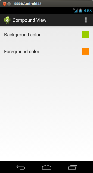
}The running application should look like the following screenshot.
7. Canvas API
7.1. Introduction to the canvas API
The Canvas API allows to create complex graphical effects.
You paint on a Bitmap surface.
The Canvas class provides the drawing methods to draw on a bitmap.
The Paint class specifies how you draw on the bitmap.
7.2. The Canvas class
The Canvas object contains the bitmap on which you draw.
It also provides methods for drawing operations:
-
drawARGB()for drawing a color -
drawBitmap()to draw aBitmap -
drawText()to draw a text -
drawRoundRect()to draw a rectangle with rounded corners and much more.
7.3. The Paint class
For drawing on the Canvas object you use an object of type Paint.
The Paint class allows to specify the color, font and certain effects for the drawing operation.
The setStyle() method allows you to specify how it should be drawn. Option are to paint:
* Only the outline (Paint.Style.STROKE)
* the filled part (Paint.Style.FILL)
* both the outline and the filled part (Paint.Style.STROKE_AND_FILL)
You can set the alpha channel of the
Paint
via the
setAlpha()
method.
Via
Shaders
you can define that the
Paint
is filled with more than one color.
7.4. Shader
A shader allows defining a
Paint
object the content which should be drawn. For example, you can use a
BitmapShader
to define that a bitmap should be used to draw. This allows you for
example to draw an image with rounded corners.
Define a
BitmapShader
for your
Paint
object and use the
drawRoundRect()
method to draw a rectancle with rounded corners.
Other Shaders provided by the Android platform are LinearGradient, RadialGradient and SweepGradient for drawing color gradients.
To use a Shaders assign it to your Paint object via the setShader() method.
If the area which is filled is larger than the
Shaders
you can define via the
Shader tile mode
how the rest should be filled. The
Shader.TileMode.CLAMP
constant
defines that the edge corners should be used to fill the
extra space, the
Shader.TileMode.MIRROR
constant defines that the image is mirrored and
Shader.TileMode.REPEAT
defines that the image will be repeated.
7.5. Persisting view data
Most standard
views
can save there state so that it can be persisted by
the system. The Android system calls the
onSaveInstanceState()
method and the
onRestoreInstanceState(Parcable)
to save and restore the view state.
The convention is to extend
View.BasedSavedState
as a static inner class in the view for persisting the data.
Android
searches based on the ID of
the
view
in the layout for the
view
and
pass a
Bundle
to the
view
which the
view
can use to restore its state.
You should save and restore the user interface state as the user left it, e.g., the scroll position or the active selection.
8. Example of a custom view
You find an example for a custom view (including touch support) under the following URL: https://www.vogella.com/tutorials/AndroidTouch/article.html#singletouch
9. Custom view resources
9.1. vogella Java example code
If you need more assistance we offer Online Training and Onsite training as well as consulting