This tutorial gives an introduction into the CSS styling capabilities of Eclipse plug-ins and Eclipse RCP applications.
1. Eclipse and declarative styling
The visual appearance of your Eclipse application can be styled using external files based on the CSS 2.1 standard.
CSS selectors used in Eclipse are identifiers, which relate to widgets or other elements, for example predefined pseudo classes.
Non-standard properties are prefixed with either swt- or eclipse-.
The following example shows a CSS file that defines the styling for an Eclipse application.
Label, Button {
    font: Verdana 10px;
    background-color: #e0e0e0;
    color: black;
}

Text {
    font: Verdana 10px;
}

Table, Tree {
    background-color: #f2f2f2;
    swt-header-background-color: #d0d0d0;
    swt-header-color: black;
    color: black;
}

Composite Text {
    background-color: white;
    color: black;
}

SashForm {
    background-color: #c1d5ef;
}

.MTrimBar {
    color: white;
    font: Verdana 8px;
}

Shell, Composite, .MTrimBar {
    background-color: #e0e0e0;
}

CTabItem:selected {
    background-color: #d0d0d0;
    color: black;
}
SWT has certain limitations concerning component styling. These limitations are based on the restrictions of the underlying operating system or limitations in SWT itself. For example, it is not possible to style menus because this is not supported by SWT. In every Eclipse release, these limitations are reduced, as full styling for SWT widgets is an important feature.
|
In most cases it is possible to overcome the styling restrictions of SWT in RCP applications.
For example, you can use |
NOTE: To turn off styling completely, you can provide the cssTheme none parameter as a launch argument.
2. Styling using themes
Styling can be defined via two means:
-
Using themes - allows dynamic theme switching
-
Using applicationCSS - allows defining fixed styling
You can define themes for styling your application.
This can be done via extensions in the plugin.xml file.
To create new themes you define extensions for the org.eclipse.e4.ui.css.swt.theme extension point.
Such an extension defines an ID for the style and a pointer to the CSS file.
You can define the default theme via the cssTheme property in your org.eclipse.core.runtime.products extension.
This can be used to define a fixed styling.
You need to set cssTheme, otherwise the theming service is not available at runtime.
|
The Eclipse platform provides the theme service with an instance of the IThemeEngine interface.
Via this instance you can change the active theme at runtime.
The switching of themes is demonstrated in the following handler code.
package com.vogella.tasks.ui.handlers;

import org.eclipse.e4.core.di.annotations.Execute;
import org.eclipse.e4.ui.css.swt.theme.IThemeEngine;

public class ThemeSwitchHandler {
    private static final String DEFAULT_THEME = "com.vogella.eclipse.css.default";
    private static final String RAINBOW_THEME = "com.vogella.eclipse.css.rainbow";

    @Execute
    public void switchTheme(IThemeEngine engine) {
        if (!engine.getActiveTheme().getId().equals(DEFAULT_THEME)){
            // second argument defines that change is
            // persisted and restored on restart
            engine.setTheme(DEFAULT_THEME, true);
        } else {
            engine.setTheme(RAINBOW_THEME, true);
        }
    }
}
You can specify a fixed styling of your application.
This is done via a property for the org.eclipse.core.runtime.products extension point in the plugin.xml file.
The value of the applicationCSS property points to your CSS file via a URI.
The URI follows the platform:/plugin/BundleSymbolicName/path/file convention.
The following example demonstrates such a URI:
platform:/plugin/com.vogella.tasks.ui/css/default.cssThe screenshot shows an example of the plugin.xml file with a defined applicationCSS property.
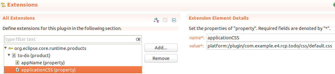
The corresponding file is shown below.
<?eclipse version="3.4"?>
<plugin>

 <extension
   id="product"
   point="org.eclipse.core.runtime.products">
  <product
     application="org.eclipse.e4.ui.workbench.swt.E4Application"
     name="to-do">
   <property
        name="appName"
        value="to-do">
   <property
     name="applicationCSS"
     value="platform:/plugin/com.example.e4.rcp.todo/css/default.css">
  </product>
 </extension>

</plugin>
3. CSS support for standard Eclipse elements
3.1. CSS attributes and selectors
CSS selectors used in Eclipse are identifiers that relate to widgets or other elements, for example, predefined pseudo classes. Non-standard properties are prefixed with either swt- or eclipse-.
You can use the swt-data-class attribute to query the class hierarchy of an object.
For example, the following selector will identify all Shells elements from a JFace dialog:
Shell[swt-data-class ~= 'org.eclipse.jface.dialogs.Dialog'] {

    background-color: rgb(236, 245, 250);
    swt-background-mode: force;
}
The CSS attributes for SWT widgets that can be styled are listed under the following link: https://github.com/eclipse-platform/eclipse.platform.ui/blob/master/docs/CSS.md
Model elements of your Eclipse application, e.g., MPartStack or MPart can be used as selectors for styling. The CSS selectors are based on the Java classes for the model elements. Some examples are given in the following table.
| Model Element | CSS Selector |
|---|---|
MPart |
.MPart |
MPartStack |
.MPartStack |
MPartSashContainer |
.MPartSashContainer |
For example, you could hide the minimize and maximize button of a MPartStack via the following CSS rule.
.MPartStack {
    swt-maximize-visible: false;
    swt-minimize-visible: false;
}
3.2. CSS pseudo classes in Eclipse
Eclipse supports CSS pseudo classes, but these are disabled by default.
You can enable them via the Java property org.eclipse.e4.ui.css.dynamic=true.
The following table lists several of the available pseudo classes.
| CSS pseudo classes | Description |
|---|---|
Button:checked |
Selects checked buttons |
:active |
For example, shell:active selects the active shell |
:selected |
Allows you to style a selected element, e.g., a part in a PartStack. |
Button {
    background: yellow;
}

Button:checked {
    background: blue;
}

Button:disabled {
    background: green;
}
You can test the effect of this CSS with the following coding.
Button pushButton = ButtonFactory.newButton(SWT.PUSH).text("Press me").create(parent);
Button checkButton= ButtonFactory.newButton(SWT.CHECK).onSelect(t -> pushButton.setEnabled(!pushButton.getEnabled())).text("Press me").create(parent);
checkButton.setSelection(true);
Currently, only the selected property of the button (checked) is evaluated dynamically.
This could be enhanced in the framework, but would require a code contribution.
|
See Pseudo classes in SWT for the project documentation.
3.3. Styling based on a CSS class or ID
You can assign a CSS ID or class to widgets in your source code and use them as selectors for styling. An identifier is supposed to be unique while a class can be assigned to several elements.
The following example demonstrates how to set an identifier and a class on SWT widgets.
// IStylingEngine is injected
@Inject IStylingEngine engine;

// more code....

Label label = new Label(parent, SWT.NONE);
Text text = new Text(parent, SWT.BORDER);

// set the ID, should be unique in the same window
engine.setID(label, "MyCSSTagForLabel");

// set the class, can be used several times
engine.setClassname(text, "error");
The setID and setClassname methods use the setData method on the widget.
You could use the SWT setData method directly, as demonstrated in the following example.
// more code....

Label label = new Label(parent, SWT.NONE);
Text text = new Text(parent, SWT.BORDER);

// set the ID, must be unique in the same window
text.setData("org.eclipse.e4.ui.css.id", "MyCSSTagForLabel");

// set the class, can be used several times
label.setData("org.eclipse.e4.ui.css.CssClassName", "MyCSSTagForLabel")
These IDs or classes can be addressed in the CSS file via the # or the . selector.
#MyCSSTagForLabel{
    color: blue;
}

.error {
    border: 1px red;
}
Another example would be the assignment of an image to a label via CSS.
#logo {
    background-image: url('platform:/plugin/com.vogella.rcp.customization/icons/img_login.png');
}
On the label you must set the CSS id or the class.
imgLabel.setData("org.eclipse.e4.ui.css.id", "logo");3.4. Ignore certain widgets during styling
The org.eclipse.e4.ui.css.disabled key can be used to instruct the CSS engine to ignore certain widgets.
// more code....
yourWidget.setData("org.eclipse.e4.ui.css.disabled", Boolean.TRUE);
3.5. Colors and gradients
Colors can be defined in different ways.
For example, the color white can be described as white, rgb(255,255,255) or #ffffff.
Since Eclipse 4.3 color constants from SWT can be used, e.g., SWT.COLOR_BLACK or SWT.COLOR_WIDGET_BACKGROUND.
Text {
    color: COLOR-CYAN;
    background-color: COLOR-WIDGET-BACKGROUND;
}

.MPart .InfoPane {
    color: COLOR-INFO-FOREGROUND;
    background-color: COLOR-INFO-BACKGROUND;
}| Note that the CSS value uses a "-" whereas the SWT constants use an "_". |
Styling supports gradients for the background color of user interface widgets. Linear and radial gradients are supported. The definition of gradients is demonstrated in the following listing.
/* linear gradient */
/* background-color: gradient linear color_1 [color_2]* [percentage]* */

/* for example */
background-color: gradient linear white black
background-color: gradient linear white black blue
background-color: gradient linear white black 50%
background-color: gradient linear white black 50% 20%

/* radial gradient */
/* background-color: gradient radial color_1 [color_2]* [percentage]* */

/* for example */
background-color: gradient radial white black
background-color: gradient radial white black 50%
If you use the optional percentage in the definition, then the color change will be done after the defined percentage. The following picture shows the result of different settings.
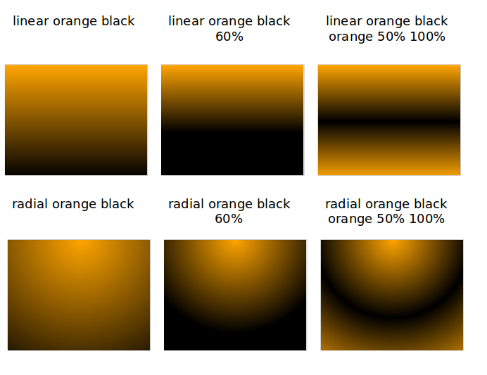
| The current gradient specification is not compliant with the CSS specification and it might change in the future. |
3.6. CSS imports
Eclipse supports the import of existing stylesheets via the @import directive using the platform URI notation.
For example, the following stylesheet would import an existing dark theme of the org.vogella.ui.themes plug-in.
@import url("platform:/plugin/org.vogella.ui.themes/css/e4-dark.css");

/* add new CSS rules here. You can also override settings defined in the imported CSS
by using the same selector-property combination */| If you import CSS files from another plug-in, it requires that the plug-in that contains the imported CSS file is included in your runtime. |
3.7. Extending an existing theme
You can add additional styling to an existing theme.
For example, if you defined additional settings for the default dark theme of the Eclipse IDE in a file called css\additional.css, you can register it with the following extension.
 <extension
         point="org.eclipse.e4.ui.css.swt.theme">
      <stylesheet
            uri="css/additional.css">
         <themeid
               refid="org.eclipse.e4.ui.css.theme.e4_dark">
         </themeid>
      </stylesheet>
   </extension>
3.8. Example: Hide the close button
You can hide the close button of your parts with the following CSS.
CTabItem {
    swt-show-close: false !important;
}
4. CSS support for custom widgets
The CSS support offers two extension points for adding CSS capabilities to custom widgets:
-
org.eclipse.e4.ui.css.core.elementProvider -
org.eclipse.e4.ui.css.core.propertyHandler
Those extension points are defined in the org.eclipse.e4.ui.css.core plug-in.
You find some predefined implementations for SWT in the org.eclipse.e4.ui.css.swt plug-in.
4.1. The org.eclipse.e4.ui.css.core.elementProvider extension point
Under this extension, you can specify for which entries in the CSS style sheet the IElementProvider is responsible.
The org.eclipse.e4.ui.css.core.elementProvider extension defines an IElementProvider that returns the widget’s adapter (ElementAdapter).
IElementProvider returns an org.w3c.dom.Element.
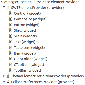
In general, the returned org.w3c.dom.Element is an instance of an ElementAdapter.
By the widget properties under the provider, you point to the class of the actual widget, like org.eclipse.swt.widgets.Control, for which the provider is responsible.
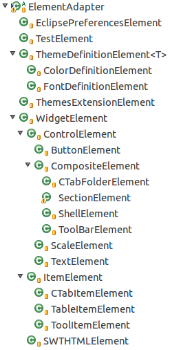
The SWTElementProvider, for instance, contains those ElementAdapter implementations that are shown in the type hierarchy screenshot and looks like this:
/**
 * Returns the CSS class which is responsible for styling a SWT widget
 *
 * Registered via the "org.eclipse.e4.ui.css.core.elementProvider" extension
 * point for the SWT widgets
 *
 *
 *
 * {@link IElementProvider} SWT implementation to retrieve w3c Element
 * {@link SWTElement} linked to SWT widget.
 *
 */
public class SWTElementProvider implements IElementProvider {

    public static final IElementProvider INSTANCE = new SWTElementProvider();

    @Override
    public Element getElement(Object element, CSSEngine engine) {
        if (element instanceof Text) {
            return new TextElement((Text) element, engine);
        }
        if (element instanceof Button) {
            return new ButtonElement((Button) element, engine);
        }
        if (element instanceof Scale) {
            return new ScaleElement((Scale) element, engine);
        }
        if (element instanceof Shell) {
            return new ShellElement((Shell) element, engine);
        }
        if (element instanceof CTabFolder) {
            return new CTabFolderElement((CTabFolder) element, engine);
        }
        if (element instanceof ToolBar) {
            return new ToolBarElement((ToolBar) element, engine);
        }
        if (element instanceof Composite) {
            return new CompositeElement((Composite) element, engine);
        }
        if (element instanceof Control) {
            return new ControlElement((Control) element, engine);
        }
        if (element instanceof CTabItem) {
            return new CTabItemElement((CTabItem) element, engine);
        }
        if (element instanceof TableItem) {
            return new TableItemElement((TableItem) element, engine);
        }
        if (element instanceof ToolItem) {
            return new ToolItemElement((ToolItem) element, engine);
        }
        if (element instanceof Item) {
            return new ItemElement((Item) element, engine);
        }
        if (element instanceof Widget) {
            return new WidgetElement((Widget) element, engine);
        }
        return null;
    }
}
See https://github.com/eclipse-platform/eclipse.platform.ui/blob/master/docs/CSS.md for more information.
4.2. The org.eclipse.e4.ui.css.core.propertyHandler extension point
In the org.eclipse.e4.ui.css.core.propertyHandler extension point, you define an adapter of type ElementAdapter for your widget that is used by the CSS engine.
Here you specify an implementation of an ICSSPropertyHandler, where different property-names for the widget can be defined.
This implementation is responsible for applying the CSS properties to the underlying widget.
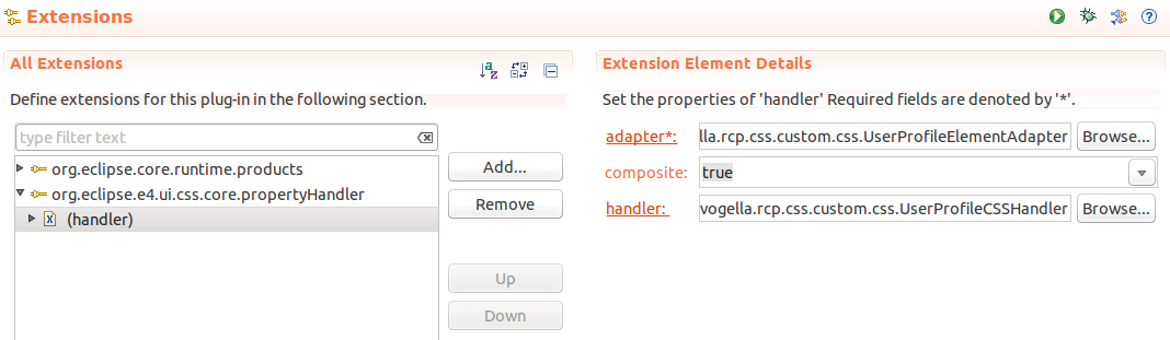
You have to define three properties for a org.eclipse.e4.ui.css.core.propertyHandler.
| Property | Description |
|---|---|
adapter |
The |
composite |
A boolean that specifies whether the widget is a composite or not |
handler |
|
Here you can see a sample of the org.eclipse.e4.ui.css.swt projects propertyHandler extension point:
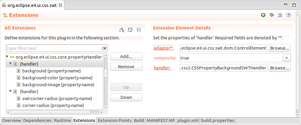
These are the default ElementAdapter implementations for the adapter property in the screenshot above:
In the ICSSPropertyHandler implementation those property-names are read and applied to the actual widget.
The CSSPropertyBackgroundSWTHandler and its parent AbstractCSSPropertyBackgroundHandler are examples of such an implementation of the ICSSPropertyHandler.
Here the background property is applied for certain widgets.
The AbstractCSSPropertyBackgroundHandler class delegates to the methods for the property-names.
These are applied in the propertyHandler extension point to its subclasses like the CSSPropertyBackgroundSWTHandler.
    @Override
    public boolean applyCSSProperty(Object element, String property,
            CSSValue value, String pseudo, CSSEngine engine) throws Exception {
        if ("background".equals(property)) {
            applyCSSPropertyBackground(element, value, pseudo, engine);
        }
        if ("background-attachment".equals(property)) {
            applyCSSPropertyBackgroundAttachment(element, value, pseudo, engine);
        }
        if ("background-color".equals(property)) {
            applyCSSPropertyBackgroundColor(element, value, pseudo, engine);
        }
        if ("background-image".equals(property)) {
            applyCSSPropertyBackgroundImage(element, value, pseudo, engine);
        }
        if ("background-position".equals(property)) {
            applyCSSPropertyBackgroundPosition(element, value, pseudo, engine);
        }
        if ("background-repeat".equals(property)) {
            applyCSSPropertyBackgroundRepeat(element, value, pseudo, engine);
        }
        return false;
    }
The following listing is the applyCSSPropertyBackgroundColor method of the CSSPropertyBackgroundSWTHandler.
It shows how the background-color property-name is applied for several widgets:
@Override
    public void applyCSSPropertyBackgroundColor(Object element, CSSValue value,
            String pseudo, CSSEngine engine) throws Exception {
        Widget widget = (Widget) ((WidgetElement) element).getNativeWidget();
        if (value.getCssValueType() == CSSValue.CSS_PRIMITIVE_VALUE) {
            Color newColor = (Color) engine.convert(value, Color.class, widget
                    .getDisplay());
            if (widget instanceof CTabItem) {
                CTabFolder folder = ((CTabItem) widget).getParent();
                if ("selected".equals(pseudo)) {
                    // tab folder selection manages gradients
                    CSSSWTColorHelper.setSelectionBackground(folder, newColor);
                } else {
                    CSSSWTColorHelper.setBackground(folder, newColor);
                }
            } else if (widget instanceof Control) {
                GradientBackgroundListener.remove((Control) widget);
                CSSSWTColorHelper.setBackground((Control) widget, newColor);
                CompositeElement.setBackgroundOverriddenByCSSMarker(widget);
            }
        } else if (value.getCssValueType() == CSSValue.CSS_VALUE_LIST) {
            Gradient grad = (Gradient) engine.convert(value, Gradient.class,
                    widget.getDisplay());
            if (grad == null) {
                return; // warn?
            }
            if (widget instanceof CTabItem) {
                CTabFolder folder = ((CTabItem) widget).getParent();
                Color[] colors = CSSSWTColorHelper.getSWTColors(grad,
                        folder.getDisplay(), engine);
                int[] percents = CSSSWTColorHelper.getPercents(grad);

                if ("selected".equals(pseudo)) {
                    folder.setSelectionBackground(colors, percents, true);
                } else {
                    folder.setBackground(colors, percents, true);
                }

            } else if (widget instanceof Control) {
                GradientBackgroundListener.handle((Control) widget, grad);
                CompositeElement.setBackgroundOverriddenByCSSMarker(widget);
            }
        }
    }
5. CSS Tools
5.1. CSS Spy
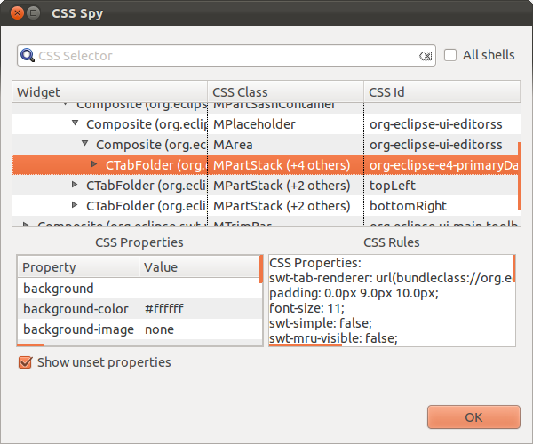
The CSS spy tool helps you see the possible styling options for selected elements. CSS spy is part of the e4 tooling project and can be installed from its update site.
You can open the CSS spy via the Shift+Alt+F5 shortcut.
CSS spy allows you to see the available properties and the current style settings.
5.2. CSS Scratchpad
The CSS Scratchpad allows you to change CSS rules interactively. It is part of the e4 tooling project.
You open it via the Ctrl+Shift+Alt+F6 shortcut.
If you click the Apply button, the entered CSS is applied at runtime to your application.
6. Exercise: Use CSS styling
In this exercise, you style your application. The user can switch the styling at runtime.
6.1. Create a new plug-in and add dependencies
Create a new simple plug-in named com.vogella.eclipse.css.
Add the org.eclipse.e4.ui.css.swt.theme plug-in as a plug-in dependency to the manifest file of your new plug-in.
6.2. Create the CSS files
Create a folder named css in the root of your com.vogella.eclipse.css plug-in.
Create the following css/default.css file.
Label, Button {
    font: Verdana 10px;
    background-color: #e0e0e0;
    color: black;
}

Text {
    font: Verdana 10px;
}

Table, Tree {
    background-color: #f2f2f2;
    swt-header-background-color: #d0d0d0;
    swt-header-color: black;
    color: black;
}

Composite Text {
    background-color: white;
    color: black;
}

SashForm {
    background-color: #c1d5ef;
}

.MTrimBar {
    color: white;
    font: Verdana 8px;
}

Shell, Composite, .MTrimBar {
    background-color: #e0e0e0;
}

CTabItem:selected {
    background-color: #d0d0d0;
    color: black;
}
In addition, create the following css/rainbow.css file.
Shell {
    swt-background-mode: default;
    background-color: red orange yellow green orange 30% 60% 75% 95%
}

.MPartStack {
    font-size: 22px;
    color: orange;
}
6.3. Create the theme extensions
Select the Extensions tab in the MANIFEST.MF editor.
|
If the Extensions tab does not exist, click on the Extensions link in the Overview tab. |
Create two extensions for the org.eclipse.e4.ui.css.swt.theme extension point.
For this, press the Add… button in the Extensions tab.
Select the org.eclipse.e4.ui.css.swt.theme extension point and press the Finish button.
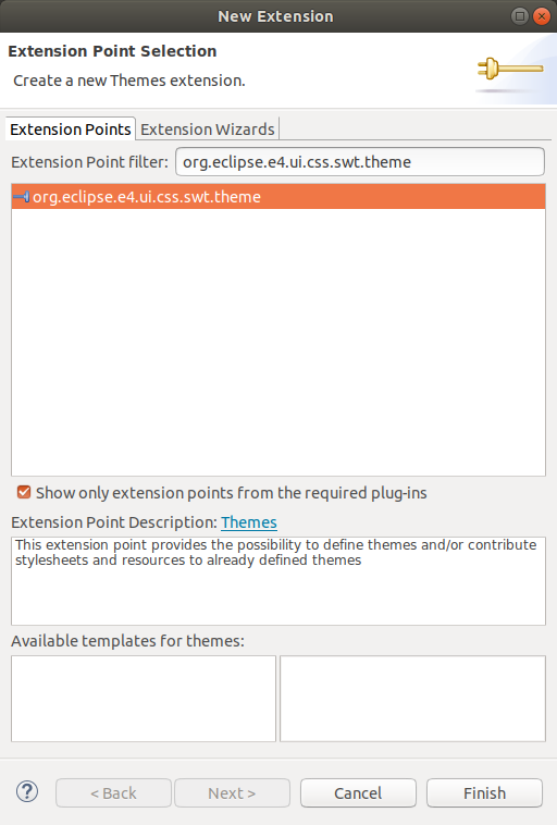
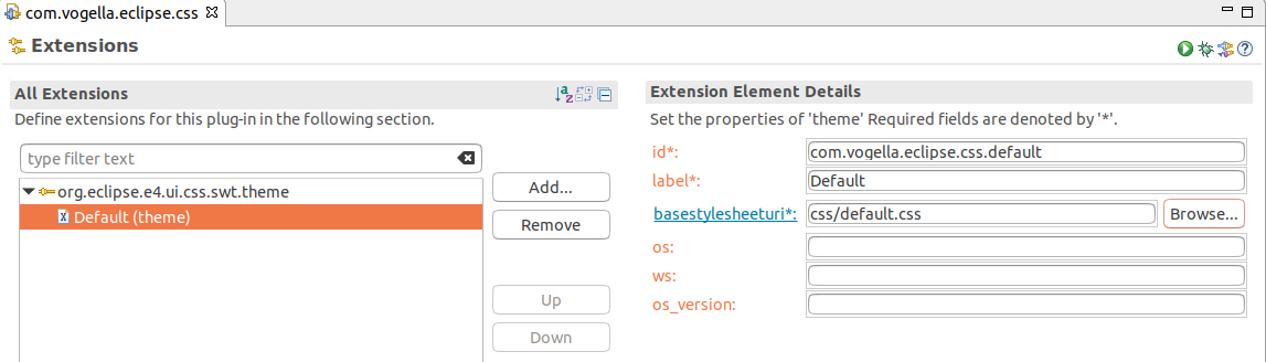
Right-click on the org.eclipse.e4.ui.css.swt.theme extension and select the menu entry to create a new theme.

The following screenshots show the extensions you should create.
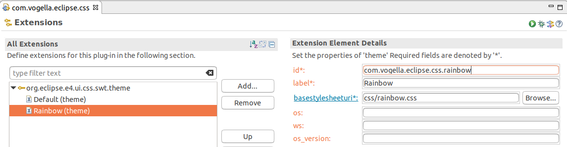
If you open the plugin.xml tab in the MANIFEST.MF editor or if you open the
plugin.xml file in a text editor, it should look similar to the following listing.
<?xml version="1.0" encoding="UTF-8"?>
<?eclipse version="3.4"?>
<plugin>
   <extension
         point="org.eclipse.e4.ui.css.swt.theme">
      <theme
            basestylesheeturi="css/default.css"
            id="com.vogella.eclipse.css.default"
            label="Default">
      </theme>
      <theme
            basestylesheeturi="css/rainbow.css"
            id="com.vogella.eclipse.css.rainbow"
            label="Rainbow">
      </theme>
   </extension>

</plugin>
6.4. Adjust the build.properties file
Make sure all CSS files are included in your build through the build.properties file of your plug-in. This makes them available in the exported application.
The build.properties file should look similar to the following listing:
source.. = src/
output.. = bin/
bin.includes = META-INF/,\
               .,\
               plugin.xml,\
               css/
6.5. Setting the default theme in the application
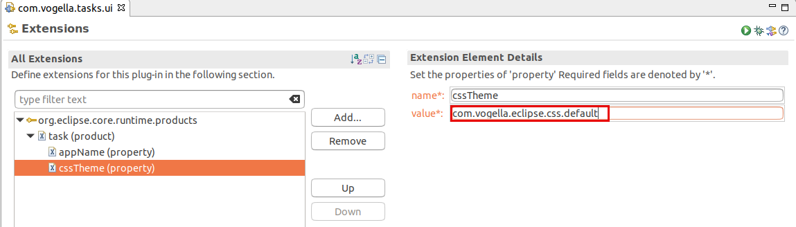
Now you need to configure the default theme via a property on your product extension.
For this, open the plugin.xml file in your com.vogella.tasks.ui plug-in and select the Extensions tab.
Add the cssTheme property to your product and point to the com.vogella.eclipse.css.default theme.
To add a new property, right-click on the product and click on property to add a new property. Do NOT press the Add… button.

|
This must be done in the |
If present, remove an existing entry for applicationCSS.
applicationCSS is an alternative way to define fixed styling for the application, but it is not used in this exercise.
|
Ensure that the |
The entry in the plugin.xml of com.vogella.tasks.ui should look similar to the following:
<?xml version="1.0" encoding="UTF-8"?>
<?eclipse version="3.4"?>
<plugin>

   <extension
         id="product"
         point="org.eclipse.core.runtime.products">
      <product
            name="to-do"
            application="org.eclipse.e4.ui.workbench.swt.E4Application">
         <property
               name="appName"
               value="Task Management">
         </property>
         <property
               name="cssTheme"
               value="com.vogella.eclipse.css.default">
         </property>
      </product>
   </extension>

</plugin>
6.6. Add the new plug-in to the product (via the feature)
Add your com.vogella.eclipse.css plug-in to your feature.
Afterward, start the application via the product configuration file.
7. Optional exercise: Styling the login screen
In this exercise, you will ensure that the widgets created by the lifecycle handler of your application are styled.
7.1. Implement styling
Change your Manager class to the following to apply one of your CSS files to the widgets in the login screen.
package com.vogella.tasks.ui.lifecycle;
import jakarta.inject.Inject;
import org.eclipse.e4.core.contexts.IEclipseContext;
import org.eclipse.e4.ui.internal.workbench.E4Workbench;
import org.eclipse.e4.ui.internal.workbench.swt.PartRenderingEngine;
import org.eclipse.e4.ui.workbench.IWorkbench;
import org.eclipse.e4.ui.workbench.lifecycle.PostContextCreate;
import org.eclipse.equinox.app.IApplicationContext;
import org.eclipse.jface.window.Window;
import org.eclipse.swt.SWT;
import org.eclipse.swt.graphics.Rectangle;
import org.eclipse.swt.widgets.Display;
import org.eclipse.swt.widgets.Monitor;
import org.eclipse.swt.widgets.Shell;
import org.osgi.service.prefs.BackingStoreException;
import com.vogella.tasks.ui.dialogs.PasswordDialog;
public class Manager {
private String user;
@PostContextCreate
public void postContextCreate(IApplicationContext appContext, Display display, IEclipseContext context) {
final Shell shell = new Shell(SWT.SHELL_TRIM);
PasswordDialog dialog = new PasswordDialog(shell);
if (user != null) {
dialog.setUser(user);
}
// close the static splash screen
appContext.applicationRunning();
// position the shell
setLocation(display, shell);
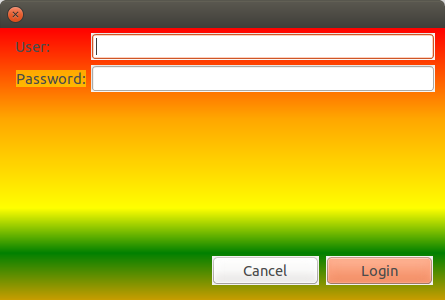
String cssURI = "platform:/plugin/com.vogella.eclipse.css/css/rainbow.css";
context.set(E4Workbench.CSS_URI_ARG, cssURI);
PartRenderingEngine.initializeStyling(shell.getDisplay(), context);
// open the dialog
if (dialog.open() != Window.OK) {
// close the application
System.exit(-1);
} else {
// get the user from the dialog
String userValue = dialog.getUser();
}
}
private void setLocation(Display display, Shell shell) {
Monitor monitor = display.getPrimaryMonitor();
Rectangle monitorRect = monitor.getBounds();
Rectangle shellRect = shell.getBounds();
int x = monitorRect.x + (monitorRect.width - shellRect.width) / 2;
int y = monitorRect.y + (monitorRect.height - shellRect.height) / 2;
shell.setLocation(x, y);
}
}7.2. Validate
Start your application and ensure the splash screen is styled according to your settings.
8. Exercise: Define a custom CSS selector and CSS property
In this exercise, you will implement your custom CSS selector and property for styling the header of a user profile widget.
The aim is to apply custom styling to the custom widget, called UserProfileWidget.
You will define a new UserProfileWidget CSS selector and a new header-background-color CSS property.
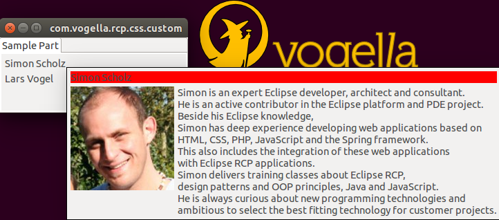
The result may look like that, where the user profile widget is embedded in a Tooltip:
8.1. Add dependencies
Add the org.eclipse.e4.ui.css.core and the org.eclipse.e4.ui.css.swt plug-ins as a dependency to your application.
8.2. Adjust custom CSS to your CSS file
Add the following CSS to your CSS file, which is used in your application plug-in.
UserProfileWidget { (1)
   header-background-color: red; (2)
}| 1 | Custom CSS selector |
| 2 | Custom CSS property |
8.3. Create the user profile widget
To learn how to implement customizations for CSS, we need a custom widget that should be styled.
We implement a simple custom widget, which is a Composite that consists of three other Composites for the header, image, and description area.
For the following widget, you should create a widget package in your plug-in and place the UserProfileWidget class into it.
package com.vogella.rcp.css.custom.widget;

import org.eclipse.jface.layout.GridDataFactory;
import org.eclipse.jface.layout.GridLayoutFactory;
import org.eclipse.jface.resource.ImageDescriptor;
import org.eclipse.jface.resource.JFaceResources;
import org.eclipse.jface.resource.LocalResourceManager;
import org.eclipse.jface.resource.ResourceManager;
import org.eclipse.swt.SWT;
import org.eclipse.swt.graphics.Color;
import org.eclipse.swt.layout.GridData;
import org.eclipse.swt.widgets.Composite;
import org.eclipse.swt.widgets.Label;

public class UserProfileWidget extends Composite {
    private ResourceManager resourceManager;

    private String text = "";
    private String headerText = "";
    private ImageDescriptor imageDescriptor;

    private Label imageLabel;
    private Label headerLabel;
    private Label labelText;

    private Composite head;

    public UserProfileWidget(Composite parent, int style) {
        super(parent, style);
        GridLayoutFactory.swtDefaults().numColumns(2).applyTo(this);

        head = new Composite(this, SWT.NONE);
        GridLayoutFactory.fillDefaults().applyTo(head);
        GridDataFactory.fillDefaults().span(2, 1).grab(true, false).applyTo(head);
        headerLabel = new Label(head, SWT.NONE);
        headerLabel.setLayoutData(new GridData(SWT.BEGINNING, SWT.CENTER, false, false));
        headerLabel.setText(getHeaderText());

        Composite imageComposite = new Composite(this, SWT.NONE);
        GridLayoutFactory.fillDefaults().applyTo(imageComposite);
        GridDataFactory.fillDefaults().applyTo(imageComposite);
        imageLabel = new Label(imageComposite, SWT.NONE);
        ImageDescriptor imgDescriptor = getImage();
        if (imgDescriptor != null) {
            imageLabel.setImage(getResourceManager().create(imgDescriptor));
        }

        Composite textComposite = new Composite(this, SWT.NONE);
        GridLayoutFactory.fillDefaults().applyTo(textComposite);
        GridDataFactory.fillDefaults().grab(true, true).applyTo(textComposite);
        labelText = new Label(textComposite, SWT.NONE);
        labelText.setText(getText());
    }

    protected ResourceManager getResourceManager() {
        if (null == resourceManager) {
            resourceManager = new LocalResourceManager(JFaceResources.getResources(), this);
        }
        return resourceManager;
    }

    protected String getText() {
        return text;
    }

    public void setText(String text) {
        this.text = text;
        if(labelText != null) {
            labelText.setText(text);
        }
    }

    protected String getHeaderText() {
        return headerText;
    }

    public void setHeaderText(String headerText) {
        this.headerText = headerText;
        if (headerLabel != null) {
            headerLabel.setText(headerText);
        }
    }

    protected ImageDescriptor getImage() {
        return imageDescriptor;
    }

    public void setImage(ImageDescriptor imageDescriptor) {
        this.imageDescriptor = imageDescriptor;
        if (imageLabel != null) {
            imageLabel.setImage(getResourceManager().create(imageDescriptor));
        }
    }

    public Color getHeaderColor() {
        return head.getBackground();
    }

    public void setHeaderColor(Color color) {
        head.setBackground(color);
        headerLabel.setBackground(color);
    }
}
The most important method for our custom CSS here is the last setHeaderColor() method, which we will use for our header-background-color CSS property.
To test this widget, you can place it on a new part in your application or in a tooltip as it is depicted in the screenshot above.
Afterwards, you should set a certain header-text, an image, and a description-text to the UserProfileWidget.
8.4. Adding the org.eclipse.e4.ui.css.core.propertyHandler extension point
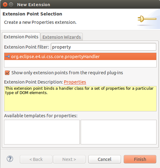
Select the Extensions tab in the editor for the plugin.xml file and add the org.eclipse.e4.ui.css.core.propertyHandler extension point.
You create an extension in the Extensions tab by pressing the Add… button.

Select the org.eclipse.e4.ui.css.core.propertyHandler extension point and press the Finish button.
By clicking on the adapter hyperlink of the handler in the plugin.xml, a "New Java Class" dialog appears, where you define the CompositeElement as superclass.
Call the class itself UserProfileElementAdapter and place it into a css package.
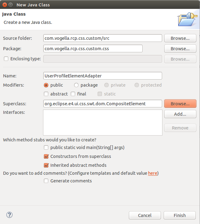
The UserProfileElementAdapter class should look like this:
package com.vogella.rcp.css.custom.css;

import org.eclipse.e4.ui.css.core.engine.CSSEngine;
import org.eclipse.e4.ui.css.swt.dom.CompositeElement;

import com.vogella.rcp.css.custom.widget.UserProfileWidget;

public class UserProfileElementAdapter extends CompositeElement {

    public UserProfileElementAdapter(UserProfileWidget composite, CSSEngine engine) {
        super(composite, engine);
    }
}
In this case, we only have a custom composite that needs to be adapted.
The propertyHandler needs a handler that has to be an implementation of the ICSSPropertyHandler interface.
Therefore, we need to click on the handler hyperlink in the plugin.xml, and the following "New Java Class" dialog appears:
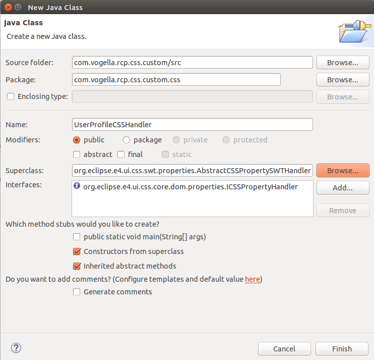
The AbstractCSSPropertySWTHandler is an abstraction of the ICSSPropertyHandler interface for SWT widgets.
It handles the cast to an SWT Control, which is then passed to the applyCSSProperty and retrieveCSSProperty methods.
In the UserProfileCSSHandler implementation we apply the header-background-color to our UserProfileWidget.
package com.vogella.rcp.css.custom.css;

import org.eclipse.e4.ui.css.core.dom.properties.ICSSPropertyHandler;
import org.eclipse.e4.ui.css.core.dom.properties.converters.ICSSValueConverter;
import org.eclipse.e4.ui.css.core.engine.CSSEngine;
import org.eclipse.e4.ui.css.swt.properties.AbstractCSSPropertySWTHandler;
import org.eclipse.swt.graphics.Color;
import org.eclipse.swt.widgets.Control;
import org.w3c.dom.css.CSSValue;

import com.vogella.rcp.css.custom.widget.UserProfileWidget;

public class UserProfileCSSHandler extends AbstractCSSPropertySWTHandler implements ICSSPropertyHandler {

    private static final String HEADER_COLOR = "header-background-color";

    @Override
    protected void applyCSSProperty(Control control, String property, CSSValue value, String pseudo, CSSEngine engine)
            throws Exception {
        if (control instanceof UserProfileWidget) {
            UserProfileWidget userProfileWidget = (UserProfileWidget) control;
            if (HEADER_COLOR.equalsIgnoreCase(property) && (value.getCssValueType() == CSSValue.CSS_PRIMITIVE_VALUE)) {
                Color newColor = (Color) engine.convert(value, Color.class, control.getDisplay());
                userProfileWidget.setHeaderColor(newColor);
            }
        }
    }

    @Override
    protected String retrieveCSSProperty(Control control, String property, String pseudo, CSSEngine engine)
            throws Exception {
        if (control instanceof UserProfileWidget) {
            UserProfileWidget userProfileWidget = (UserProfileWidget) control;
            if (HEADER_COLOR.equalsIgnoreCase(property)) {
                ICSSValueConverter cssValueConverter = engine.getCSSValueConverter(String.class);
                return cssValueConverter.convert(userProfileWidget.getHeaderColor(), engine, null);
            }
        }
        return null;
    }

}
At first, we check if the given Control is a UserProfileWidget and cast it.
Then we check if the property that should be applied is our header-background-color.
In case these checks are valid, the CSSEngine can be used to convert the given CSSValue in our case to a Color.
Finally, we set this color for the header of our custom widget.
|
If you are using a different UI toolkit than SWT, you must only implement the |
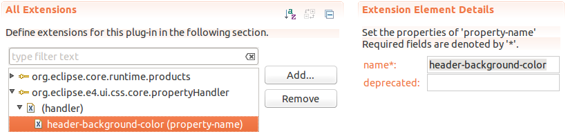
The last thing we need to do for the propertyHandler extension is to define for which property-name this handler is responsible:
8.5. Adding the org.eclipse.e4.ui.css.core.elementProvider extension point
Now the second and last extension point has to be added:
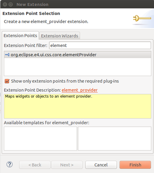
After adding the org.eclipse.e4.ui.css.core.elementProvider extension point, we can add an IElementProvider to it.
For this, click on the class hyperlink and give the class the name UserProfileWidgetElementProvider.
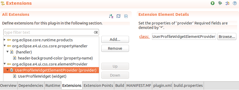
The widget property you can see in the screenshot above points to the fully qualified name of the UserProfileWidget (com.vogella.rcp.css.custom.widget.UserProfileWidget).
The widget property may be used several times, so that one IElementProvider implementation can be in charge of several widgets.
The UserProfileWidgetElementProvider class we just created by clicking the class hyperlink in the plugin.xml implements the IElementProvider interface and should look like this:
package com.vogella.rcp.css.custom.css;

import org.eclipse.e4.ui.css.core.dom.IElementProvider;
import org.eclipse.e4.ui.css.core.engine.CSSEngine;
import org.w3c.dom.Element;

import com.vogella.rcp.css.custom.widget.UserProfileWidget;

public class UserProfileWidgetElementProvider implements IElementProvider {

    @Override
    public Element getElement(Object element, CSSEngine engine) {
        if(element instanceof UserProfileWidget) {
            return new UserProfileElementAdapter((UserProfileWidget) element, engine);
        }

        return null;
    }

}
In this IElementProvider implementation, we return the UserProfileElementAdapter, which we previously defined when we attached this adapter to the propertyHandler.
8.6. Validate
Now we can check if our custom CSS definitions are applied to the UserProfileWidget.
Make sure that you have completed all the steps and then start your application.
-
The
UserProfileWidgethas been applied to a Part, and a sample header-text, image, and description-text has been set for the widget. -
The CSS snippet has been added to the active CSS file
-
You have configured the
org.eclipse.e4.ui.css.core.propertyHandlerandorg.eclipse.e4.ui.css.core.elementProviderextension points correctly
9. CSS styling resources
9.1. vogella Java example code
If you need more assistance we offer Online Training and Onsite training as well as consulting