This tutorial describes the principles to style Android applications. It also explains how to create and use styles and themes in Android applications
1. Android interface design prinicples
1.1. Designing Android Applications
For designing great Android applications you should follow the following themes that are described in detail on the https://developer.android.com/design/index.html - Android design pages.
-
Design for touch
-
Show only what is needed
-
Don’t ask for permission for a certain action but allow the user to undo his action
-
Only interrupt, if it is important
-
Keep messages brief, use pictures
-
Never lose your users data
-
Allow users to make important things fast
-
If it looks the same, it should act the same
-
Help users make decisions, but let them have the final say
There are certain general design best practices that are listed here:
-
Design for performance - A well designed application should start fast. You should target for less than one second in average to start the application. All potentially slow operations should be performed asynchronously.
-
Design for responsiveness - Feedback to the user should be provided instantaneous. Long lasting operations should provide feedback to the user that they are running.
-
Design for instant data - Your application should provide, if possible, recent data once the user starts it. You should therefore use services to fetch data from external servers to be decoupled from the user interface.
-
Design for optimized battery life - Your application should consume as little energy as possible. Stop user interface updates and listeners if your application is currently not visible. You can listen to relevant events, e.g., if power supply is plugged in to perform larger updates. If you fetch data from an external server you should, if appropriate, use the Google push notification service. This allows you to access the network only if data is available.
-
Design for efficient network access - Your application should avoid unnecessary network access, via push notifications. You should also consider the current available network. If you are connected to a wireless lane, your application can download more data.
The https://developer.android.com/design/index.html - Android design pages explain the design principles of Android applications.
| Icon filenames are not allowed to contain special character, cannot start with a number and must be in lower case. |
|
Creating promotional material The https://developer.android.com/distribute/tools/promote/device-art.html - Device Art Generator website allows you to create promotional material of your application with a nice device frame around it. Simply make a screenshot on your device and drag it onto the correct device to get a nice image for it. 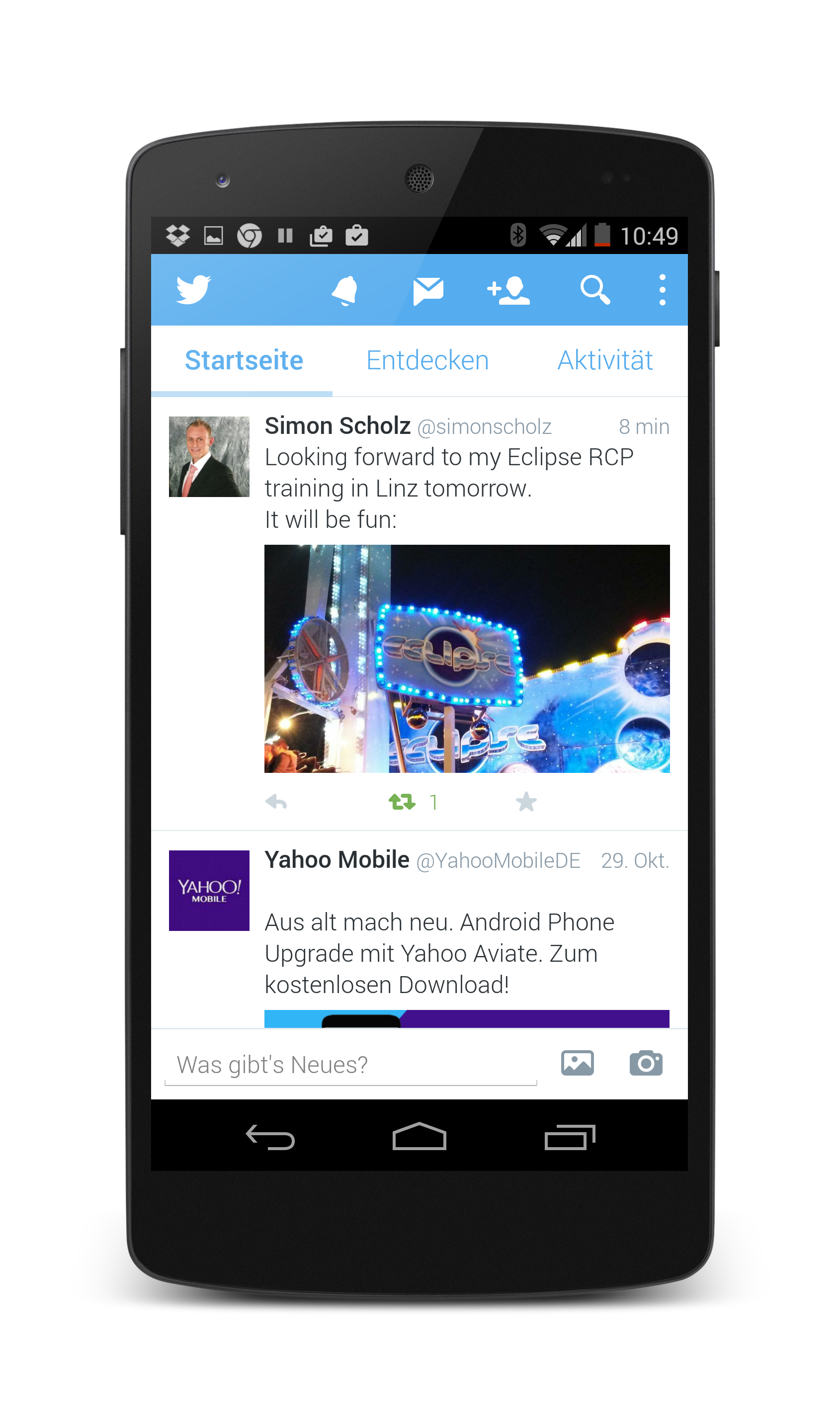 |
1.2. Responsive design
It is recommended that the application scales with the device. On a small screen only one fragment is shown, on a larger screen a second or even third fragment might be visible.
This approach is depicted by the following graphic.
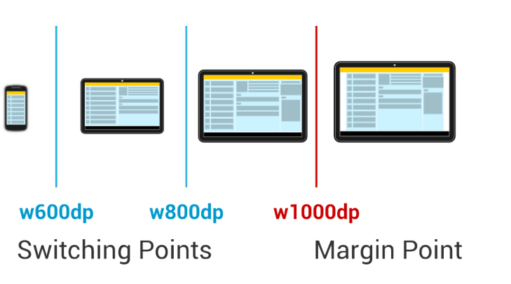
It is recommended not to use the full screen width for text in case you are beyond a certain width on a device.
This border is typically above w1000dp.
Research has shown that after this width reader much move the head to much
A way to implement margin points is to use a res/values/dimens.xml file and define a dimension for the margins. Afterwards, use resource qualifiers for the same file to define different margins for larger devices.
2. Using styles and themes in your application
2.1. Theming in Android and material design
The Android user interface design guidelines have changes over the years. The first big change for designing Android applications came with the Android 3.0 (Honeycomb) release which introduced the Holo style. The Android 5.0 (Lollipop) release was again a radical change with the Material design. The material design introduces depth into the layout and uses much more animations to provide feedback to the user.
This page also contains several downloadable resources, e.g., an icon set. You find the downloads on this website: https://developer.android.com/design/downloads/index.html
As of Android 5.0 (Lollipop, or API 21) the preferred design for Android applications is the Material design.
Material design is a guide for visual, motion, and interaction design. The Android platform provides a new theme, new widgets and new API for custom shadows and animations.
Material design support that views are drawn on top of other views by assigning an elevation level to them.
Views define an elevation level in dp (density-independent pixels).
To set the elevation of a view in a layout definition, use the android:elevation attribute.
To set the elevation of a view in the code of an activity, use the View.setElevation() method.
Android draws customizable shadows based on the value of the elevation.
Material design also provides improved API for animations and provides several default animations.
2.2. What are styles and themes
Android allow you to define the look and feel, for example, colors and fonts, of Android components in XML resource files. This way you can set style related attributes in one central place.
If the entry in the resource file is used to style a view, it is referred to as a style. If it is used for styling an activity or application it is called a theme.
To define a style or a theme, save an XML file in the /res/values directory of your project.
The root node of the XML file must be the <resources> tag.
To define a style or a theme, define an entry with the style tag and define the name attribute.
This entry can contains one or more items which define values for named attributes.
The following listing is an example for a style definition.
<resources>
    <style name="AppTheme" parent="Theme.AppCompat.Light.NoActionBar">
        <!-- Customize your theme here. -->
        <item name="colorPrimary">@color/colorPrimary</item>
        <item name="colorPrimaryDark">@color/colorPrimaryDark</item>
        <item name="colorAccent">@color/colorAccent</item>
         <item name="android:windowBackground">@color/colorBackground</item>
    </style>
</resources>
You assign the style attribute to entries in your layout file via the style=”@style/text attribute.
Styles (and themes) support inheritance by using the parent attribute of the style tag. This way the style inherits all settings from the parent style and can overwrite selected attributes.
2.3. Referring attributes in the current theme
Android lists all standard attributes that can be styled in the R.attr file. The reference for this file can be found online under the following URL: https://developer.android.com/reference/android/R.attr.html
You can refer to individual attributes of the current Android theme via the ?android:attr notation.
This notation means that you are referring to a style attribute in the currently active theme.
For example, ?android:attr/listPreferredItemHeight means: "use the value defined by the attribute called listPreferredItemHeight in the current theme.
The following layout defines buttons with the Android 4.0 button style.
<?xml version="1.0" encoding="utf-8"?>
<LinearLayout xmlns:android="http://schemas.android.com/apk/res/android"
    android:layout_width="match_parent"
    android:layout_height="match_parent"
    android:orientation="vertical" >

    <LinearLayout
        style="?android:attr/buttonBarStyle"
        android:layout_width="match_parent"
        android:layout_height="wrap_content"
        android:orientation="horizontal" >

        <Button
            android:id="@+id/Button01"
            style="?android:attr/buttonBarButtonStyle"
            android:layout_width="0dp"
            android:layout_height="wrap_content"
            android:layout_weight="1"
            android:text="Show" />

        <Button
            android:id="@+id/Button02"
            style="?android:attr/buttonBarButtonStyle"
            android:layout_width="0dp"
            android:layout_height="wrap_content"
            android:layout_weight="1"
            android:text="Change" />
    </LinearLayout>

    <EditText
        android:id="@+id/myView"
        android:layout_width="match_parent"
        android:layout_height="wrap_content"
        android:ems="10" >

        <requestFocus />
    </EditText>

</LinearLayout>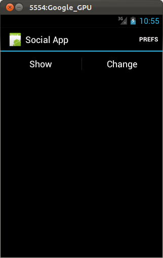
2.4. Themes
A theme is a style applied to an entire activity or application, rather than an individual view. The technique of defining a theme is the same as defining a style.
The next example show how to define your own theme while extending a platform theme.
<resources>
    <style name="AppTheme" parent="Theme.AppCompat.Light.NoActionBar">
        <!-- Customize your theme here. -->
        <item name="colorPrimary">@color/colorPrimary</item>
        <item name="colorPrimaryDark">@color/colorPrimaryDark</item>
        <item name="colorAccent">@color/colorAccent</item>
        <color name="colorBackground">#42A5F5</color>
    </style>
</resources>
2.5. Tinting of drawables
You can define the fill color for your icons. The colors can be defined via your theme and used in the definition of your drawables or views.
<vector xmlns:android="https://schemas.android.com/apk/res/android"
        android:width="24dp"
        android:height="24dp"
        android:viewportWidth="24.0"
        android:viewportHeight="24.0"
        android:tint="@color/colorAccent">
    <path
        android:fillColor="#FF000000"
        android:pathData="M12,4L12,1L8,5l4,4L12,6c3.31,0 6,2.69 6,6 0,1.01 -0.25,1.97 -0.7,2.8l1.46,1.46C19.54,15.03 20,13.57 20,12c0,-4.42 -3.58,-8 -8,-8zM12,18c-3.31,0 -6,-2.69 -6,-6 0,-1.01 0.25,-1.97 0.7,-2.8L5.24,7.74C4.46,8.97 4,10.43 4,12c0,4.42 3.58,8 8,8v3l4,-4 -4,-4v3z"/>
</vector>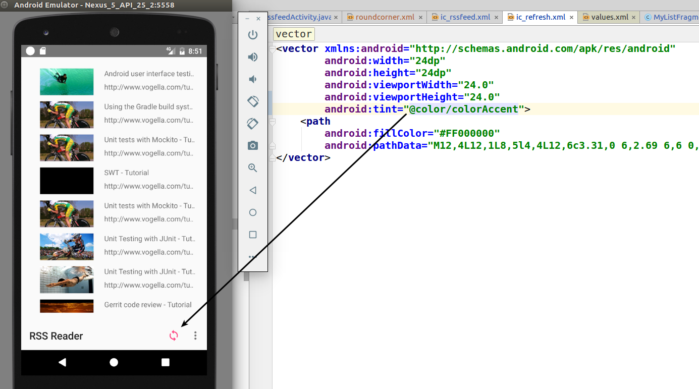
<ImageButton
        android:layout_width="48dp"
        android:layout_height="48dp"
        android:id="@+id/button"
        android:src="@drawable/ic_more_vert_24dp"
        android:tint="@color/primary" />
3. Using Android platform themes
3.1. Using material design and design support library
As of API 21 the material design is the new default design you should be used.
-
@android:style/Theme.Material.Light - light version
-
@android:style/Theme.Material.Light.DarkActionBar - light with dark toolbar
If you are using the AppCompactActivity you can use:
-
Theme.AppCompat.Light.NoActionBar
-
Theme.AppCompat.Light.DarkActionBar
The design support library provides themes with material design styles. This allows you to use material design on earlier releases. See https://developer.android.com/training/material/compatibility.html - Maintaining Compatibility for how to use the new theme in earlier releases.
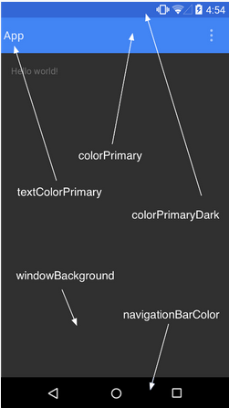
3.2. Styling the color palette
As of material design you can customize the themes base colors. The following screenshot shows several of these colors.
The following listing is an example of styling it with different colors (defined in your /res/values folder).
<resources>
  <style name="AppTheme" parent="android:Theme.Material">
    <!-- Main theme colors -->
    <!--   your app branding color for the app bar -->
    <item name="android:colorPrimary">@color/primary</item>
    <!--   darker variant for the status bar and contextual app bars -->
    <item name="android:colorPrimaryDark">@color/primary_dark</item>
    <!--   theme UI controls like checkboxes and text fields -->
    <item name="android:colorAccent">@color/accent</item>
  </style>
</resources>
You can also style the status bar with the android:statusBarColor attribute.
By default, android:statusBarColor inherits the value of android:colorPrimaryDark.
3.3. Styling individual views and view groups
As of Android 5.0 (API 21) you can also assign the android:theme for a view.
This allows changing the theme for this element and its child elements.
4. Exercise: Use and defining themes
In this exercise, you use existing themes and define your own custom theme.
The following description assumes that you are styling an application with the com.vogella.android.testapp top-level package.
If you do not have such an application, simply create use, using the empty activity template.
4.1. Remove default toolbar (action bar)
By default, Android adds a toolbar (frequently called action bar) to each activity.
For the com.vogella.android.testapp application we want to remove that default toolbar.
This gives use extra space on the screen.
To do so, modify the styles.xml file in your values resource folder like the following.
Also make sure that you set the background to your previously defined color.
<resources>
    <style name="AppTheme" parent="Theme.AppCompat.Light.NoActionBar">
        <!-- More of the existing styling -->
    </style>
</resources>|
The above listing works for activities that extends the If you are extending |
4.2. Create background color
By default, each activity in Android has a white background.
To change the background color, first add a new color definition to the colors.xml file in the values resource folder like the following.
<color name="colorBackground">#42A5F5</color>4.3. Exercise: Define a modified custom theme
It should override the android:windowBackground property with your color.
<resources>
    <style name="AppTheme" parent="Theme.AppCompat.Light.NoActionBar">
        <!-- Customize your theme here. -->
        <item name="colorPrimary">@color/colorPrimary</item>
        <item name="colorPrimaryDark">@color/colorPrimaryDark</item>
        <item name="colorAccent">@color/colorAccent</item>
         <item name="android:windowBackground">@color/colorBackground</item>
    </style>
</resources>
4.4. Validate
Ensure your AppTheme is used in the Android manifest.
Start your application.
Your application should use a different background color and no default toolbar.
5. Android Styling resources
5.1. vogella Java example code
If you need more assistance we offer Online Training and Onsite training as well as consulting